


Doordarshan, India's public broadcasting service, had been in existence since 1959. It was only as late as 1976, when it separated from All India Radio, that it got its independent brand identity

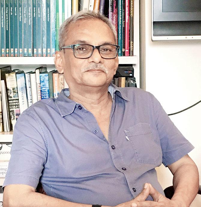
Devashis Bhattacharyya
On April 1, 1976, Devashis Bhattacharyya, then a student of mass communication at the National Institute of Design (NID), Ahmedabad, saw a classroom assignment gain the kind of mileage that few could only dream of back in the day. We are talking about a decade when retweets and reposts were part of a non-existent lingo. Yet, Bhattacharyya's student project, a logo shaped like an eye, went viral in a world of analogue.
ADVERTISEMENT
Doordarshan, India's public broadcasting service under Prasar Bharati, had been in existence since 1959. It was only as late as 1976, when Doordarshan separated from All India Radio, that it got its independent brand identity and chose Bhattacharyya's logo to lead with. "The logo was designed around the concept of harmony. To see something in totality, you need a balance of principles, a balance of masculine and feminine, of yin and yang," says Bhattacharyya, who now runs a design firm in New Delhi.
Whether we still tune in to Doordarshan or not, it is likely that most of us have grown up in the familiarity of the logo. On July 25, Shashi Shekhar Vempati, the newly appointed CEO of Prasar Bharati, announced a revamp of the logo through a public call for entries. The redesign is an attempt to woo an under-30 crowd, which largely does not share the memory of Doordarshan as earlier generations did. In an attempt to keep DD relevant and worthy of the millennials' attention span, the state-owned network, which operates 23 channels across the country, has called for applications for a new logo to recall the strong nostalgia associated with DD. The last date for submissions is on August 13 — there are 2,059 submissions so far — and the winner will be awarded Rs 1 lakh.
An eye for everyone
So, how did a student's logo design end up on a national broadcasting network? We turned to Vikas Satwalekar, a former faculty member and former executive director of NID. "The original symbols — these were not logos yet — were taken up as a classroom assignment in my symbol design class with the first batch of graphics students. It was in keeping with NID's design education philosophy of "learning by doing"," says Satwalekar, who now runs a design consulting firm in Mumbai.
Bhattacharyya, then 24, was one among the batch of students that Satwalekar taught, and worked on the symbol for nearly two months. Satwalekar presented symbols designed by six faculty members and 10 students to then Prime Minister Indira Gandhi and VP Krishnamoorthy, Doordarshan's first director general.
Once his symbol was selected, Bhattacharyya provided the drawings that became part of the animation in which swirls of wispy cloud-like formations condensed to become the Doordarshan logo. The animation played to the tune of a piece composed by Ustad Ali Ahmed Hussain Khan and Pandit Ravi Shankar in 1974.
The words, "Satyam Shivam Sundaram" that accompanied the logo, says Bhattacharyya, had to do with a directive from Doordarshan. "In those years, we must remember that Doordarshan's national broadcast had Krishi Darshan for educating farmers and the news service. If you see it that way, having the tagline of 'Satyam Shivam Sundaram' made sense. It was all part of a socialistic Nehruvian legacy that had just been handed down to Mrs Gandhi," he says.
He explains that the logo was designed make sure that it overcame technical glitches and potential distortions. "The channel was not meant to be elitist and had to be homogenised for a huge diverse target base. The solution, for me, seemed to be an all-seeing eye," he recalls.
Revamp time
The revamp announcement sparked off a fair amount of debate earlier this week. Actor Ayushmann Khurrana evoked the sentiment of the masses by tweeting, "Please don't change the Doordarshan logo. It represents my childhood." However, this is not the first time that a revamp has been sought for the logo. In 1998-99, Satwalekar modified it to encompass the channels that Doordarshan launched, such as DD Sports and DD News.
About the current revamp, however, Satwalekar believes that while it is Prasar Bharti's prerogative to do so, the strategy needs to be spelt out far more clearly. "Identities are created based on a well-articulated brand strategy, of which the symbol or the logo is just the starting point," he says, while denouncing the prize amount of R1 lakh as paltry. Bhattacharyya wisely adds that if Doordarshan wishes to appeal to the young, they will have to look inwards, at the very programming of their content, and not just at logos designed by young professionals.
 Subscribe today by clicking the link and stay updated with the latest news!" Click here!